Visualize Data With Google Charts
November 10, 2017Google Charts is a great library containing various number of charts and graphs provided by Google. Google Charts library is free to used.
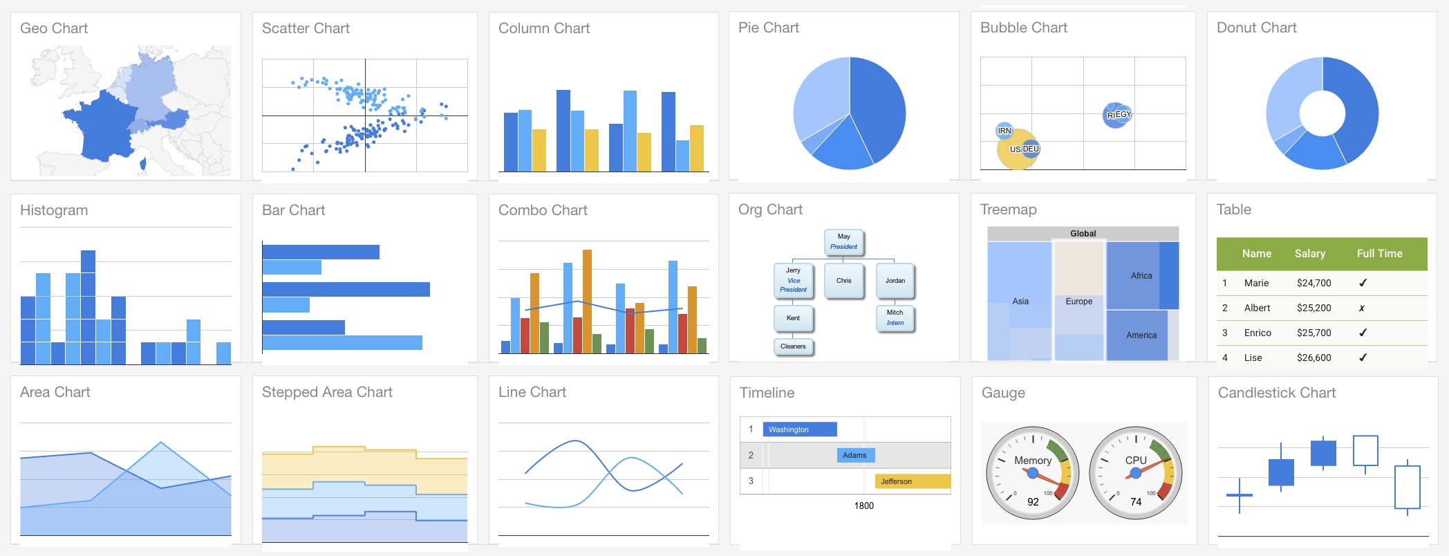
Over 20+ types of Google Charts are supported by KoolReport from the basic charts such as ColumnChart,PieChart to advanced ones such as Map, Geo or Timeline.
Example of basic chart
Suppose we have dataStore named "sale_by_country" with following data
| country | amount |
|---|---|
| US | 45000 |
| Canada | 23000 |
| Mexico | 45000 |
Like any widgets used in KoolReport, in the report's view, you use use statement to declare type of chart you want to insert:
<?php
use \koolreport\widgets\google\ColumnChart;
use \koolreport\widgets\google\PieChart;
use \koolreport\widgets\google\Map;
use \koolreport\widgets\google\Timeline;
?>
Then we can visualize above data in ColumnChart with following code
<?php
ColumnChart::create(array(
    "dataStore"=>$this->dataStore("sale_by_country"),
    "columns"=>array("country","amount")
));
?>
Let say we want to compare sales among countries then PieChart is the best options, we can do:
<?php
PieChart::create(array(
    "dataStore"=>$this->dataStore("sale_by_country"),
    "columns"=>array("country","amount")
));
?>
Easy, isn't it? The same settings can be used to create BarChart, AreaChart, DonutChart and Map.
Timeline
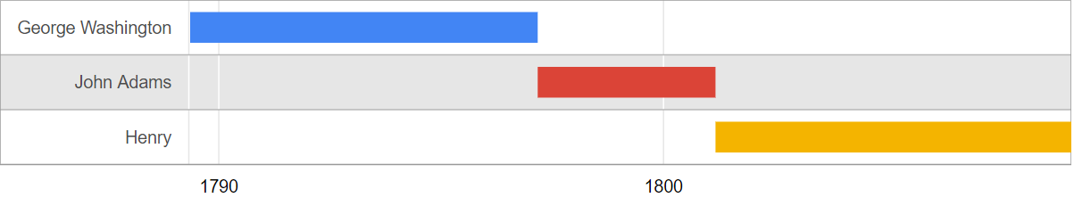
Suppose we have the dataStore named "presidents" like below:
| name | startDate | endDate |
|---|---|---|
| George Washington | 1789-03-30 | 1797-02-04 |
| John Adams | 1797-02-04 | 1801-02-04 |
| Henry | 1801-02-04 | 1809-02-04 |
We can use the Timeline chart to display the working period of president:
<?php
Timeline::create(array(
    "dataStore"=>$this->dataStore("presidents"),
    "columns"=>array(
        "name"=>array(
            "type"=>"string",
        ),
        "startDate"=>array(
            "type"=>"date",
        ),
        "endDate"=>array(
            "type"=>"date",
        ),
    )
));
?>
You will receive the Timeline below:
Drawback of Google Charts and solution
Although Google Charts is a great library, Google does not allow us to use it offline. It means that the report's charts do not work if there is no internet connection. This could be issue if you want to build intranet/offline reporting. To overcome this issue, we may use alternative charts and graphs library such as ChartJS or Morris. There will be more offline chart libraries to come in the future. We can name some such as C3, Rickshaw, etc.
Summary
In this tutorial, we have gone through the usage of Google Charts in KoolReport. The code is very simple and straight-forward. Hope that you enjoy it.
If you have any question, you may reply to us of this email.
See you in the next tutorial.
Resources
<3 koolreport team